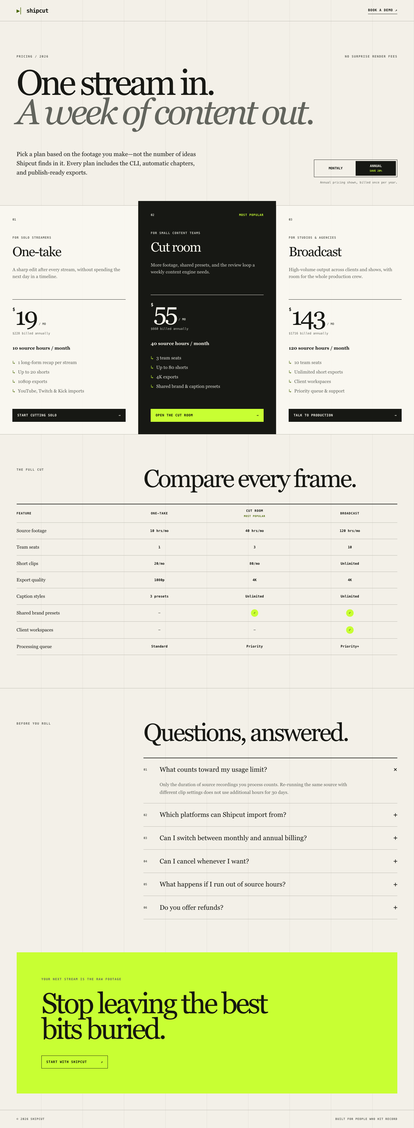
Rubric: Shipcut pricing page
Score each dimension 0 to 4. Base every score on the screenshots and the diff; do not infer intent that isn't visible in the artifacts.
Aesthetics (weight 30)
- 0: Unstyled or visually broken; default browser styles, misaligned elements, or clashing colors.
- 1: Styled but generic; looks like an unedited template with no attention to detail.
- 2: Coherent color palette and spacing, but flat and forgettable; nothing distinguishes it from a stock pricing page.
- 3: A clear visual identity, considered color and spacing choices, and a recommended-tier treatment that reads as intentional.
- 4: Production-grade polish: consistent visual rhythm, deliberate use of color and elevation, and details (icon choices, dividers, background treatment) that make the page feel designed rather than assembled.
Visual hierarchy (weight 25)
- 0: No discernible order; the eye has no clear path through pricing, features, and FAQ.
- 1: Sections exist but compete for attention; the recommended tier and price are not visually emphasized.
- 2: Basic hierarchy present (headline, tiers, table, FAQ in order) but weight and size choices are arbitrary.
- 3: Clear primary path (headline to tiers to CTA) with the recommended tier and prices reading first.
- 4: Hierarchy actively guides the buyer: price and CTA are unmissable, the comparison table supports rather than competes with the tier cards, and the FAQ is clearly secondary.
Interaction states (weight 25)
- 0: The billing toggle does not work, or buttons/links have no visible states at all.
- 1: The toggle works but interactive elements are missing hover, focus, or active states.
- 2: Hover and focus states exist but look like browser defaults or are inconsistent across elements.
- 3: Every interactive element (toggle, CTAs, FAQ disclosure if present) has a considered hover and a visible keyboard focus state.
- 4: States are polished and consistent system-wide, including a smooth toggle transition, and focus states are clearly visible without being jarring in both light and dark mode.
Responsiveness (weight 20)
- 0: Layout breaks at one or more of the three captured viewports (overlap, cut-off text, horizontal scroll).
- 1: No breakage, but the layout is just a shrunk desktop layout with cramped text or awkward wrapping on mobile.
- 2: Reasonable adaptation at each viewport, but the comparison table is hard to use on mobile (e.g., unreadable without horizontal scrolling).
- 3: Tier cards and the comparison table both adapt sensibly to each viewport, with a mobile-appropriate treatment of the table.
- 4: Each viewport feels like it was designed for that size, not just resized, including spacing, type scale, and table treatment tuned per breakpoint.